Meridian Access
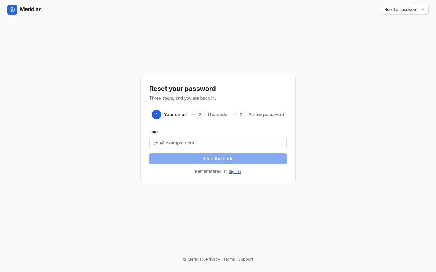
Every application starts with one of these and most galleries leave them out. Five screens over one form: a centred card, a split screen with a brand panel, the same form in a modal over a landing page, creating an account with a strength meter and a consent, and a three-step password reset with a six-digit code. The form is one component throughout, which is the point: three ways to present it, one thing to keep working.
Screens
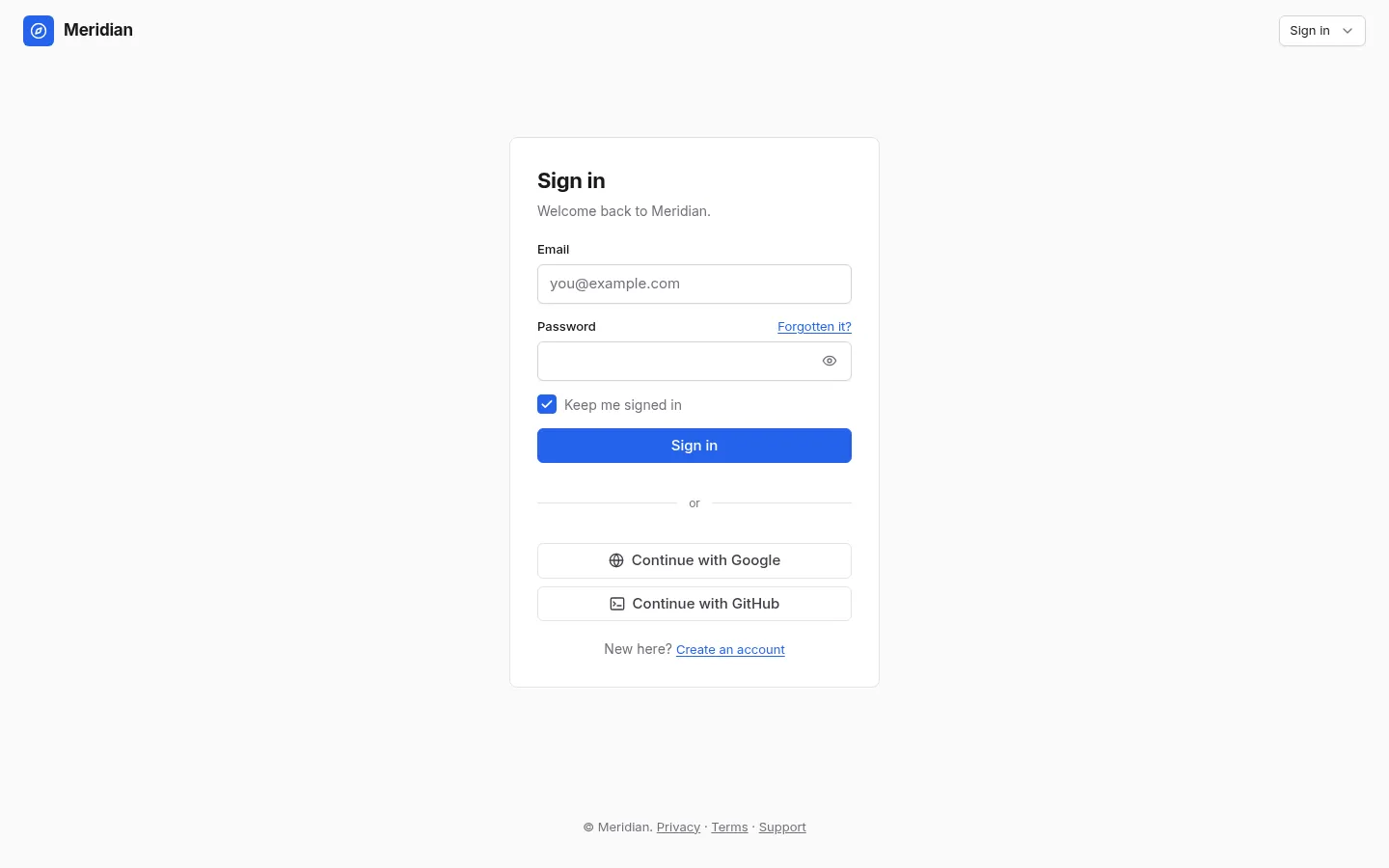
1 Sign in
One centred card: the door to an application
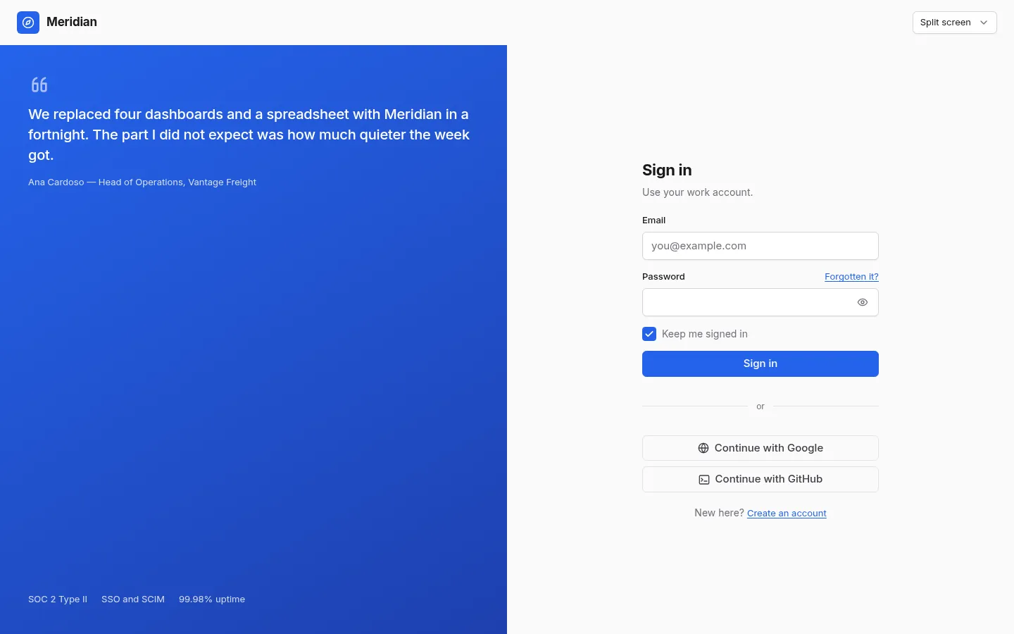
2 Split screen
The same form beside a panel that carries the brand
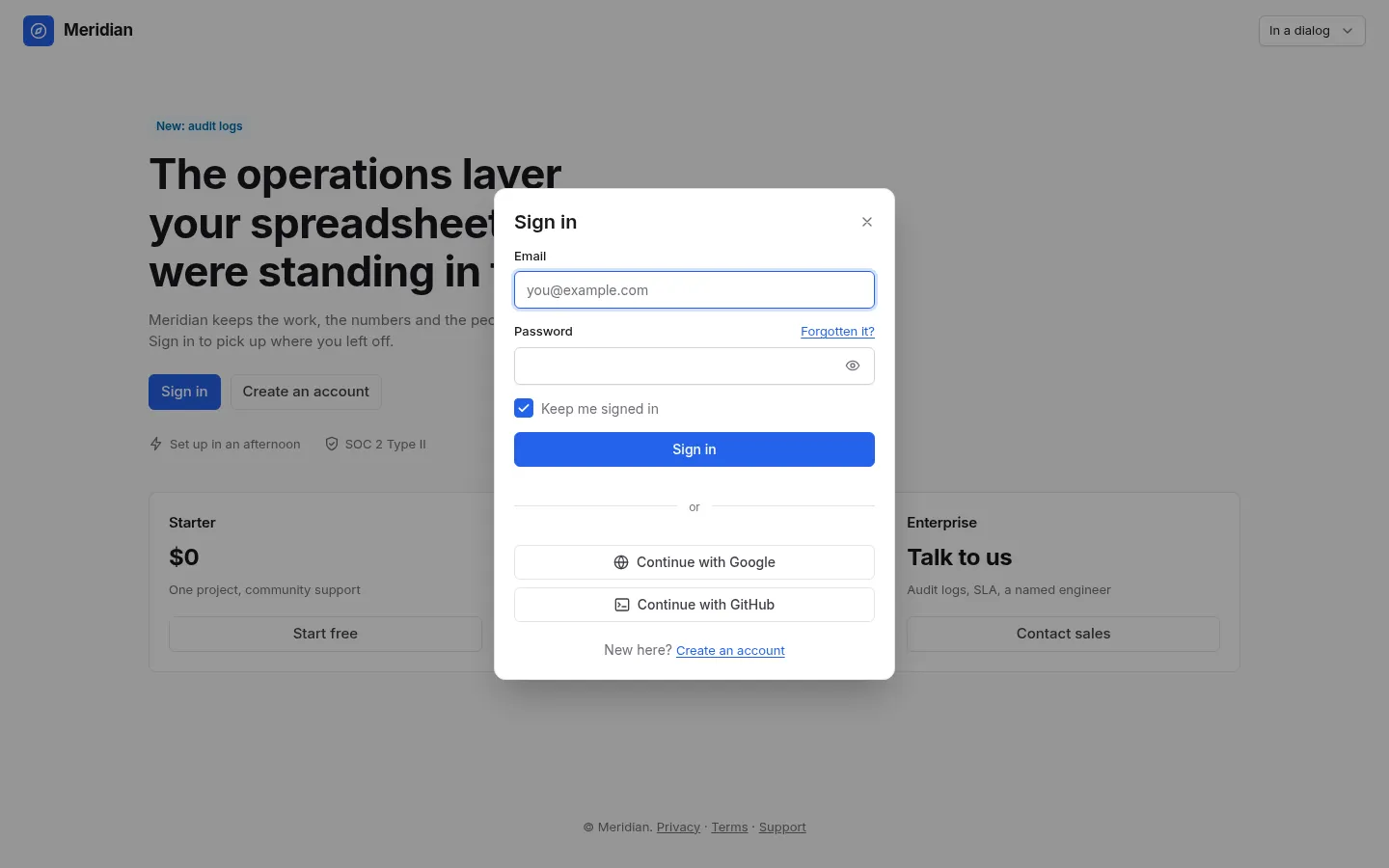
3 In a dialog
Signing in over the page, without leaving it
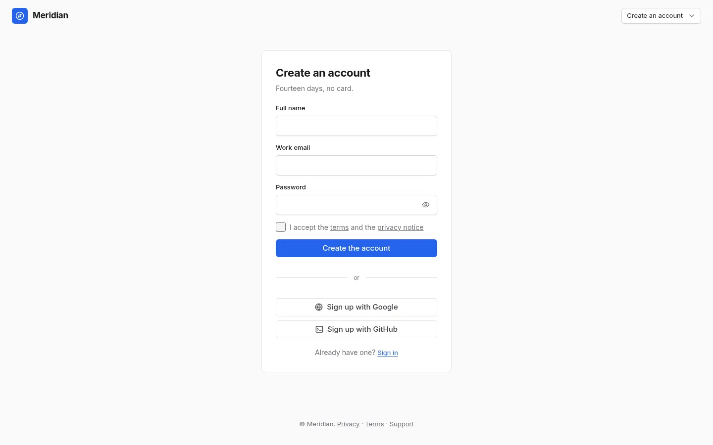
4 Create an account
A chosen password, a strength meter and a consent
5 Reset a password
Email, a six-digit code and a new password, as three steps
What's inside
5 screens and 11 components, wired together with shared state and local navigation.
Features
- One SignInForm component behind the card, the split screen and the dialog
- A password box with a toggle, and a strength meter where the password is being chosen
- A modal sign-in that keeps the page behind it, scroll position and all
- A three-step reset: email, a six-digit InputOtp code with a resend timer, a new password
- Errors shown on the field and in a message, never only in colour
Screens
Questions
About Meridian Access, and about templates in general.
Because it is shown three ways. A dialog that reimplements the sign-in is a second form to keep in step, and the one that gets forgotten is always the one behind the button.